
The United States of Inequality
The United States of Inequality
The work of Thomas Piketty and Emmanuel Saez on the evolution of top income shares has yielded a lasting and iconic image of American inequality: a long historical curve that starts high in the early years of the twentieth century (with the top 10 percent claiming about half of all income and the top 1 percent claiming about one-fifth), drops precipitously with the political innovations of the New Deal, and then climbs again—returning, by 2012, to its early-century heights—as those innovations are dismantled. This curve provides a dramatic and telling baseline for the trajectory of particular policies (like labor law and financial deregulation, for example) and for the political history of the last century.
In a new paper, Mark Price and Estelle Sommeiller have followed this methodological lead and developed estimates for top incomes shares, from 1917 through 2011, for American states and regions. This work provides texture and detail to the national story, highlighting both common elements and important differences across states. The full results are plotted below. For each year, the states (the light blue dots) are plotted by top income shares. The middle of the shaded box marks the median state (half are lower on the chosen measure, half are higher), and then the states are broken into quartiles: the middle quartiles (marked by the boxes) surround the median, the outer quartiles run along the lines between the boxes and the outer tick marks.
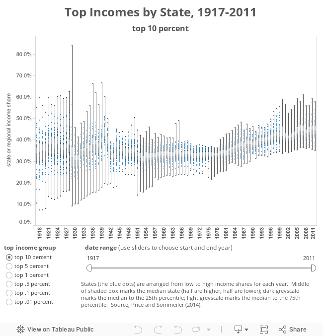
Across the full sweep of the last century, the pattern is telling. Into the 1930s the variation across states is fairly dramatic. On the eve of the Great Depression, the top 10 percent in the industrial (DuPont) fiefdom of Delaware claimed almost 85 percent of state income, the top 1 percent claim almost two-thirds, and the top .01 percent (that’s about ten tax returns in Delaware) hoarded over one-third. In the lightly developed frontier setting of Alaska the same year, by contrast, top earners took home not much more than their share: the top 1 percent of tax filers claimed a modest 5 percent of income in 1928.
Once the policies of the New Deal—collective bargaining, retirement and unemployment security, financial regulation, progressive taxation—were entrenched, the income share claimed by top earners fell and the variation across states shrank. This is evident in the box-and-whisker plot above, and in the comparison of any single state or region with the national trends. Perhaps the most striking aspect of the Price and Sommeiller data is how similar (as the graphic below underscores) state patterns are to those of the nation as a whole. Less developed and less populated states in the West and Midwest show less concentration of income at the top in the early decades. But overall, the arc of inequality—from state to nation—is remarkably consistent. Again, this is especially true in the middle years of the last century, when strong federal policies trumped (or overcame) the economic and political differences among the states.

Since 1979, as Price and Sommeiller show, both inequality and the disparity across states has widened again. In four states (Nevada, Wyoming, Mississippi, Arkansas), only the top 1 percent saw any income gains between 1979 and 2007 (the last year before the recession); in another fifteen states, the top 1 percent captured over half of all income growth over that span. Among those states whose 1 percent pulled furthest ahead of the pack, local growth in financial services (New York, Connecticut, New Jersey, Illinois) or information technology (Massachusetts, California, Washington) seem to be the driving force.
The map below illustrates this nicely. Here the states tip from green to red when the top 10 percent’s share of income exceeds one-third. Of the 16 states to top this threshold in 1972, the only ones outside the South were the tri-state home of big finance—New York, New Jersey, and Connecticut. As we move forward from there, the states in which the top 10 percent claim less than a third of total income gradually diminish in number, disappearing entirely by 1989. By 2011 the top 10 percent are claiming almost 60 percent of income in New York and Connecticut, and over 40 percent in all but three states (Iowa, Nebraska, and South Dakota).

The still-unfolding story is how much these gaps widened across the last business cycle, and especially during the first two years of the recovery. Thirty-eight of fifty states saw overall income growth over 2009–11, but in seventeen of those states only the incomes of the top 1 percent grew—and the bottom 99 percent actually lost ground. In seven more states, the top 1 percent captured over half of all income growth. In nine of the twelve states where overall incomes fell during the recovery, the top 1 percent still claimed net gains.
Colin Gordon is a professor of history at the University of Iowa. He writes widely on the history of American public policy and is the author, most recently, of Growing Apart: A Political History of American Inequality.